
Reposted with permission from the Connecting to Change the World blog.
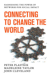 Our book cover has been praised by many and criticized by one. People like the image of the many uniting as one (in the shape of a giant wheel) to move something (another wheel). It’s a striking graphic metaphor for the book’s broadest theme: collective action to bring about change.
But… when the publisher first showed us this art, we hesitated to embrace it. If you’ve studied networks as we have, you’d see the giant wheel with its spokes as a Hub-and-Spoke (H&S) structure of connections among network members. An H&S can be an essential structure for getting a network going, but as we explain in chapter 4, it can stunt a network’s development. If the Hub through which most or all network members connect becomes too dominant and controlling, then members are not likely to connect with each other. When most information and resources flow through the Hub, this reduces the network’s diversity and usually creates bottlenecks that frustrate network members. For these reasons, we were concerned about showing an H&S structure on the cover, as if it were the ultimate structure to build.
Our publisher persuaded us that the value of the easy-to-get visual metaphor trumped our expert’s understanding of the limitations of the H&S structure.
Then came this critique from a good friend and thoughtful reader of an early draft: “My only gripe is the cover—I really can’t believe the visual is cogs—quite depleting for such an engaging book.”
The cog, he’d argue further, fails to convey the spontaneity, emergence, and surprise that powerful networks generate and that are also part of the process of generating big change in complex, dynamic social systems. The cog is a relic of the machine age imagination, top-down engineered solutions, and it has no place in a 21st century version of collective action for change. It’s hard to disagree with that.
Our book cover has been praised by many and criticized by one. People like the image of the many uniting as one (in the shape of a giant wheel) to move something (another wheel). It’s a striking graphic metaphor for the book’s broadest theme: collective action to bring about change.
But… when the publisher first showed us this art, we hesitated to embrace it. If you’ve studied networks as we have, you’d see the giant wheel with its spokes as a Hub-and-Spoke (H&S) structure of connections among network members. An H&S can be an essential structure for getting a network going, but as we explain in chapter 4, it can stunt a network’s development. If the Hub through which most or all network members connect becomes too dominant and controlling, then members are not likely to connect with each other. When most information and resources flow through the Hub, this reduces the network’s diversity and usually creates bottlenecks that frustrate network members. For these reasons, we were concerned about showing an H&S structure on the cover, as if it were the ultimate structure to build.
Our publisher persuaded us that the value of the easy-to-get visual metaphor trumped our expert’s understanding of the limitations of the H&S structure.
Then came this critique from a good friend and thoughtful reader of an early draft: “My only gripe is the cover—I really can’t believe the visual is cogs—quite depleting for such an engaging book.”
The cog, he’d argue further, fails to convey the spontaneity, emergence, and surprise that powerful networks generate and that are also part of the process of generating big change in complex, dynamic social systems. The cog is a relic of the machine age imagination, top-down engineered solutions, and it has no place in a 21st century version of collective action for change. It’s hard to disagree with that.
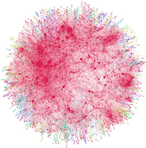 A network map is a more accurate, but less human, depiction of the connectivity espoused in the book. Photo by Andy Lamb, used under Creative Commons licensing.
An alternative to the cover art would have been network connectivity maps—colorful nodes and links—that dazzle audiences when we display them, and are quite instructive when we explain them (see chapter 6 for network mapping information).
But network maps typically represent the people in the network as circles, so you lose the “human dimension” that our cover art so dramatically provides.
A network map is a more accurate, but less human, depiction of the connectivity espoused in the book. Photo by Andy Lamb, used under Creative Commons licensing.
An alternative to the cover art would have been network connectivity maps—colorful nodes and links—that dazzle audiences when we display them, and are quite instructive when we explain them (see chapter 6 for network mapping information).
But network maps typically represent the people in the network as circles, so you lose the “human dimension” that our cover art so dramatically provides.
 Our book cover has been praised by many and criticized by one. People like the image of the many uniting as one (in the shape of a giant wheel) to move something (another wheel). It’s a striking graphic metaphor for the book’s broadest theme: collective action to bring about change.
But… when the publisher first showed us this art, we hesitated to embrace it. If you’ve studied networks as we have, you’d see the giant wheel with its spokes as a Hub-and-Spoke (H&S) structure of connections among network members. An H&S can be an essential structure for getting a network going, but as we explain in chapter 4, it can stunt a network’s development. If the Hub through which most or all network members connect becomes too dominant and controlling, then members are not likely to connect with each other. When most information and resources flow through the Hub, this reduces the network’s diversity and usually creates bottlenecks that frustrate network members. For these reasons, we were concerned about showing an H&S structure on the cover, as if it were the ultimate structure to build.
Our publisher persuaded us that the value of the easy-to-get visual metaphor trumped our expert’s understanding of the limitations of the H&S structure.
Then came this critique from a good friend and thoughtful reader of an early draft: “My only gripe is the cover—I really can’t believe the visual is cogs—quite depleting for such an engaging book.”
The cog, he’d argue further, fails to convey the spontaneity, emergence, and surprise that powerful networks generate and that are also part of the process of generating big change in complex, dynamic social systems. The cog is a relic of the machine age imagination, top-down engineered solutions, and it has no place in a 21st century version of collective action for change. It’s hard to disagree with that.
Our book cover has been praised by many and criticized by one. People like the image of the many uniting as one (in the shape of a giant wheel) to move something (another wheel). It’s a striking graphic metaphor for the book’s broadest theme: collective action to bring about change.
But… when the publisher first showed us this art, we hesitated to embrace it. If you’ve studied networks as we have, you’d see the giant wheel with its spokes as a Hub-and-Spoke (H&S) structure of connections among network members. An H&S can be an essential structure for getting a network going, but as we explain in chapter 4, it can stunt a network’s development. If the Hub through which most or all network members connect becomes too dominant and controlling, then members are not likely to connect with each other. When most information and resources flow through the Hub, this reduces the network’s diversity and usually creates bottlenecks that frustrate network members. For these reasons, we were concerned about showing an H&S structure on the cover, as if it were the ultimate structure to build.
Our publisher persuaded us that the value of the easy-to-get visual metaphor trumped our expert’s understanding of the limitations of the H&S structure.
Then came this critique from a good friend and thoughtful reader of an early draft: “My only gripe is the cover—I really can’t believe the visual is cogs—quite depleting for such an engaging book.”
The cog, he’d argue further, fails to convey the spontaneity, emergence, and surprise that powerful networks generate and that are also part of the process of generating big change in complex, dynamic social systems. The cog is a relic of the machine age imagination, top-down engineered solutions, and it has no place in a 21st century version of collective action for change. It’s hard to disagree with that.
 A network map is a more accurate, but less human, depiction of the connectivity espoused in the book. Photo by Andy Lamb, used under Creative Commons licensing.